WHAT’S NEW
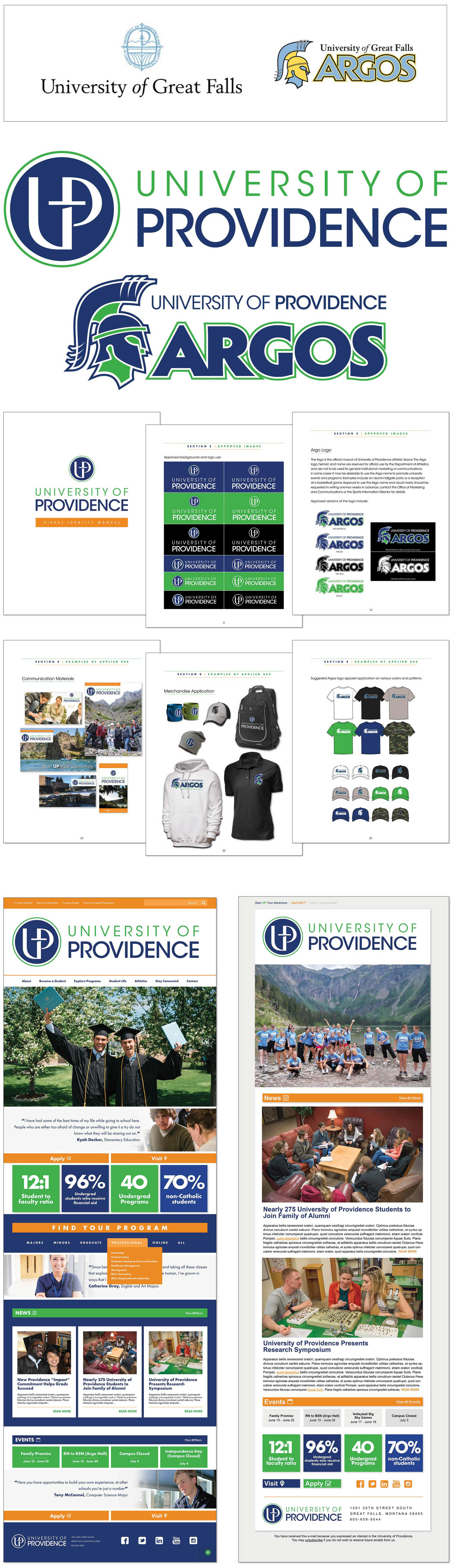
University of Providence
D E S I G N B R I E F
Name change and rebranding of the University of Great Falls to University of Providence.
The school began in 1932 as Great Falls Junior College. In 1942 it became the Great Falls College of Education.Then in the early 1950s, when it became the College of Great Falls. Again in 1995 the school was named the University of Great Falls. Finally, the University of Great Falls was renamed in July 2017 the University of Providence, with the main campus renamed the University of Providence, Great Falls. The new name recognizes the rich roots of the institution and the strength of its partnership with Providence St. Joseph Health. The logo was to reflect the Universities faith driven history while looking towards the future. The rebranding project required logo designs for both the school and its athletic department. The design would also include a style guide, website, e-news, handouts, icons and a travel piece.
“This is an exciting time for the University of Providence. “We’re here today to celebrate the visual part of this journey in revealing the new logo and brand for the University of Providence going forward.”
—Tony Aretz, University of Providence President
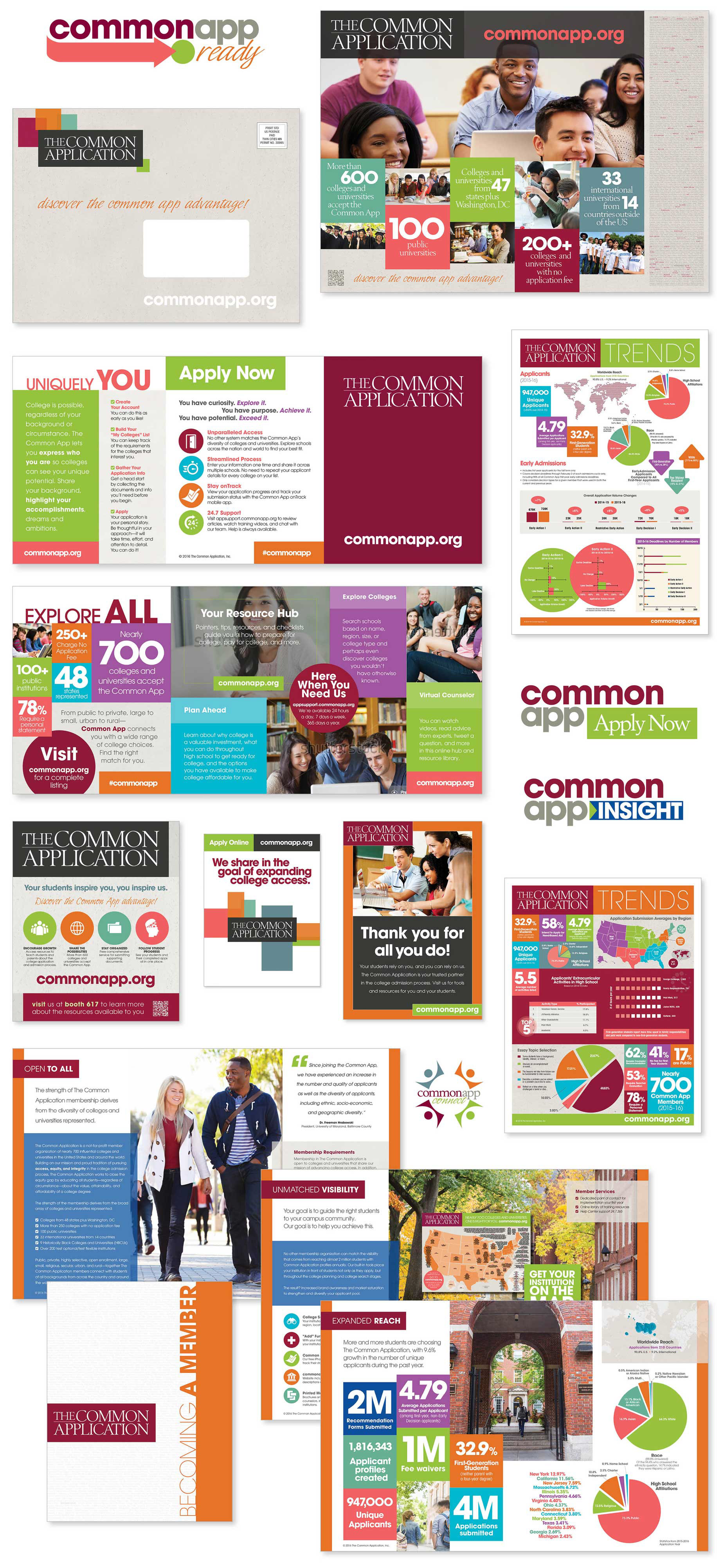
The Common Application Promotional Materials
These materials were produced for the The Lawlor Group and their client The Common Application
The Lawlor Group focuses almost exclusively on private education. They help colleges and universities, schools, and education associations understand today’s marketplace realities and make informed decisions about what’s next. The Lawlor Group and Korab Company Design have been partnering in creative promotional materials for over twenty five years.
The Common Application is a not-for-profit, member organization committed to the pursuit of access, equity, and integrity in the college admission process. The Common Application is comprised of more than 700 diverse colleges and universities from across the world. Each year, nearly 1 million students use the Common Application to submit over 4 million applications.
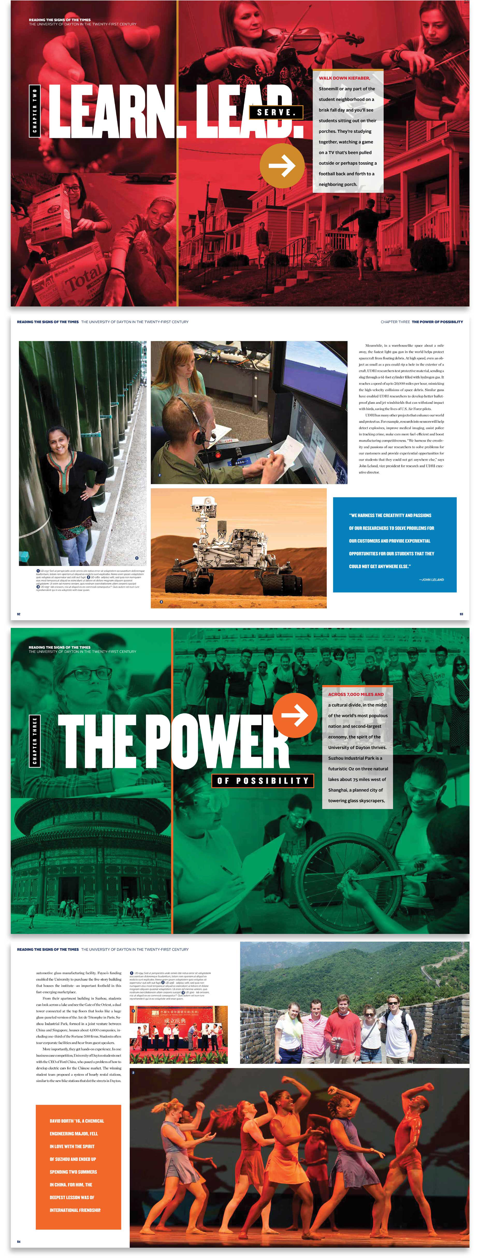
Reading the Signs of the Times: The University of Dayton in the Twenty-First Century
Cover Concepts and Interior Design
This is a book produce by the Bookhouse Group for the University of Dayton’s tribute to the gowth and expansion brought by the school’s president Daniel J. Curran.
The University of Dayton evolved from a primary school for boys to a pre-eminent Catholic research university. Today, the school continues to make an indelible mark in the world while remaining true to the ageless philosophy of Blessed William Joseph Chaminade, founder of the Society of Mary (Marianists), the religious order that founded the school in 1850. The University of Dayton educates for adaptation and change. Researchers develop technology that benefits mankind. The University encourages dialogue between faith and culture. The University fosters community and remains deeply committed to the common good. As the University of Dayton moves forward, it will build upon its strong foundation of educational excellence and religious mission.
Our goal with this book was to reflect that philosophy.

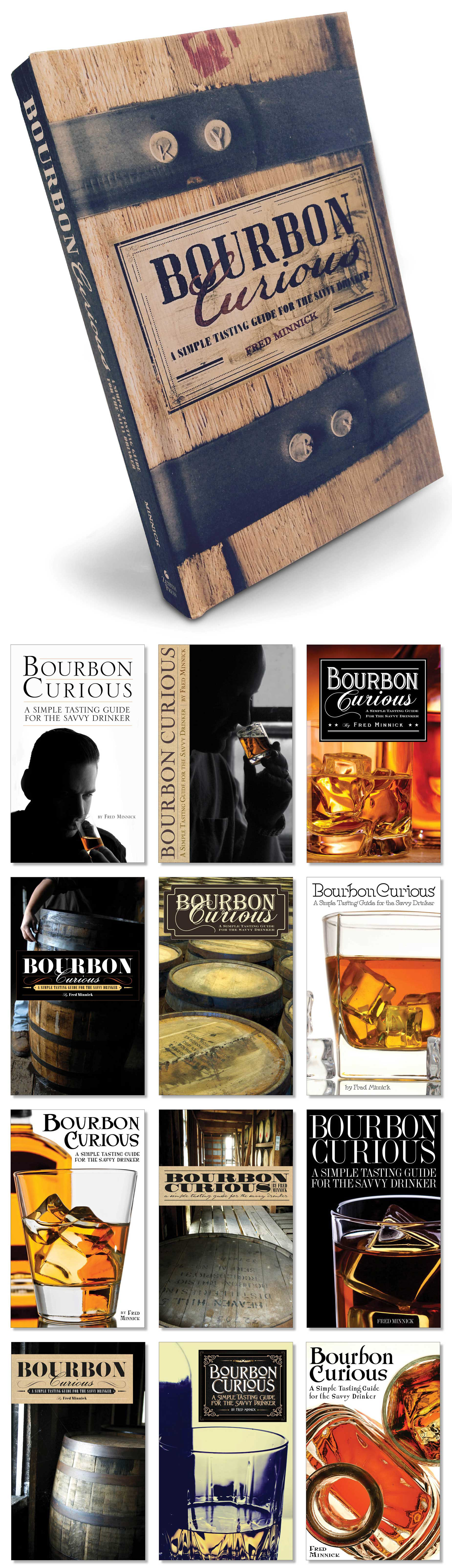
Bourbon Curious Book Jacket Design For Zenith Press
Written by award-winning whiskey writer and Wall Street Journal best-selling author Fred Minnick, Bourbon Curious is an interactive tasting journey to help you choose the right bourbons for your flavor preferences. We played with images of barrels, tasters and glasses and applied several typographic alternatives to arrive at the image on top.
AccessHealth Logo Design
AccessHealth Chiropractic Center, PC offers a bifurcated service plan. One, they target active/health conscious adults and athletes and focus on doing sports injury prevention, rehab, PT, etc. They offers Instrument Assisted Soft Tissue Mobilization (IASTM), kinesiotaping, diversified adjusting, soft tissue treatment, and strengthening and rehabilitation exercises. Second, they work with pregnant women, young mothers, prospective mothers, and babies/children.
What they wanted in a logo was it to be professional but on a more organic edge. “We like the color green but really don’t have a commitment to any particular color scheme. We are hoping for a clean and professional look, but one that is bold. Greens seems to be a good color because it gives a natural feel.” We added the leaf to push the natural theme. The spiritual meaning of a leaf signifies truth.

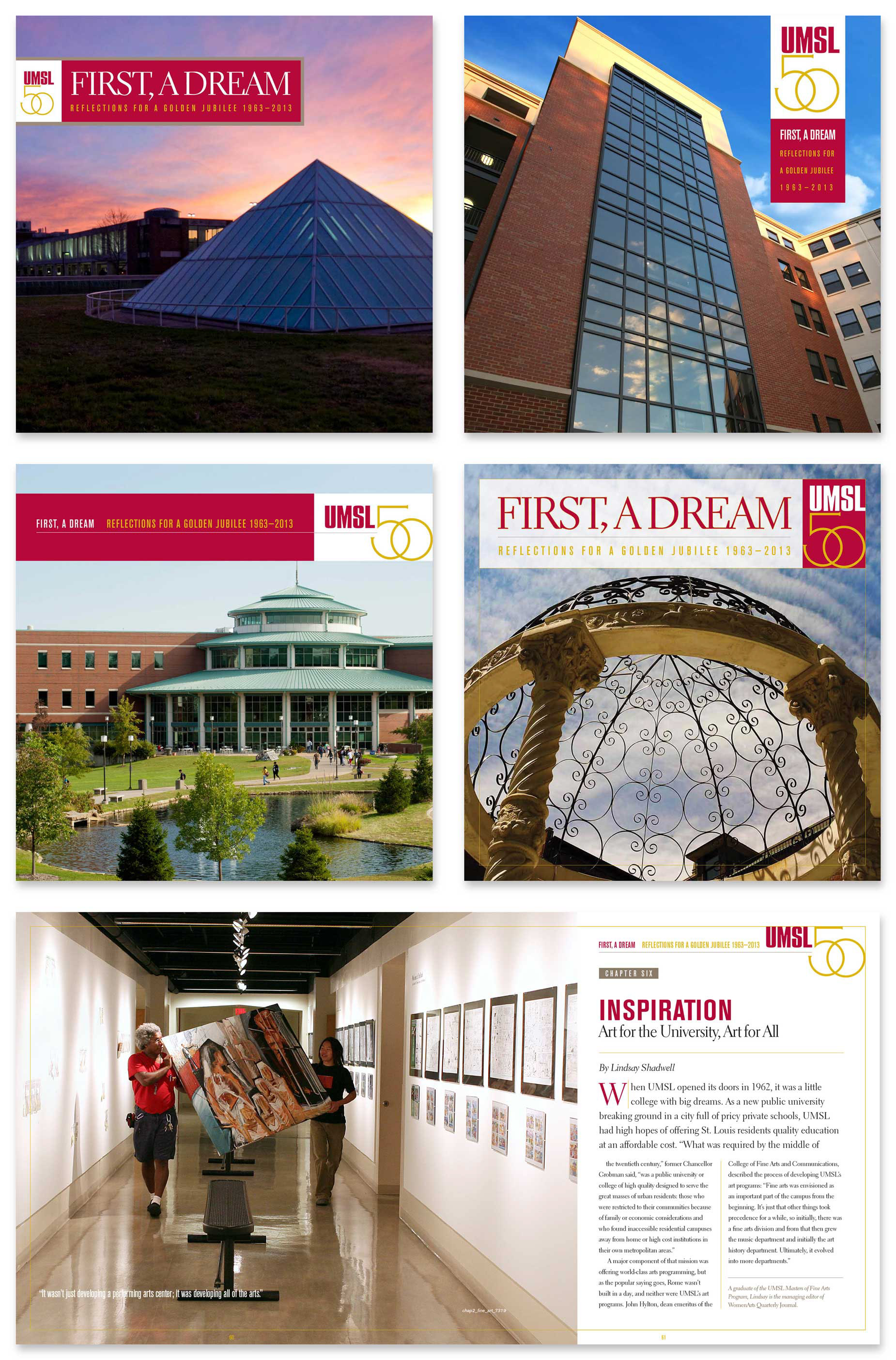
University of Missouri—St. Louis “Reflections for a Golden Jubilee 1963–2013”
Cover Concepts and Interior Design
Here are a couple of cover concepts to go with the interior design we had handle earlier for the Bookhouse Groupand their client University of Missouri—St. Louis. UMSL, the largest research university in this region, had us create a book celebration of the school’s fiftieth anniversary. The chosen cover is the one on the right middle column.
With the cover and the interior the school wanted to break from the traditional serif book typography with something more contemporary to match the feeling of the campus.
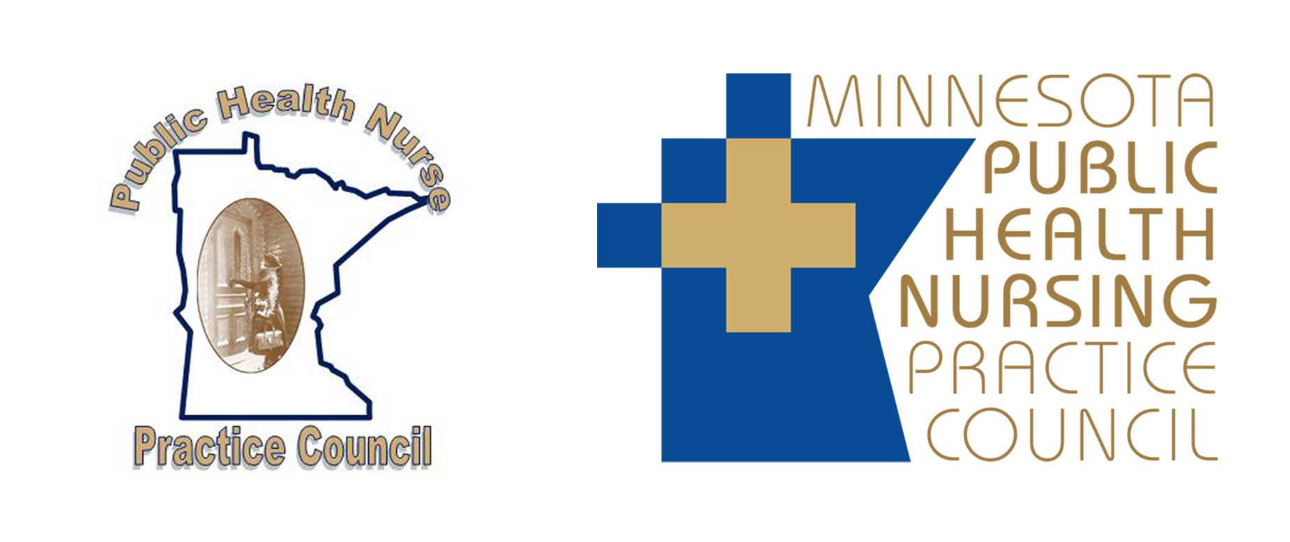
Public Health Nursing Practice Council Identity
The council wanted to update their logo that used an old photo of a nurse ringing the door with something more contemporary and readable (for such a long title) but retaining their colors and the State of Minnesota.
Here is a before and after.
The Public Health Nursing Practice Council (or PHN Practice Council) is a collaborative effort between local health department PHN experts and MDH PHN Consultants, which addresses nursing practice issues collectively and systematically in order to develop recommended PHN practice guidelines and tools for PHNs to reference and utilize within PHN practice.
© 2020 KORAB COMPANY DESIGN