
LOST & FOUND
This page is dedicated to design and typography’s wonderful past that we discover in drawers, closets, garages, junk stores, salvage yards, etc.
Please feel free to respond to these pieces or upload your own discovery by using the contact page.
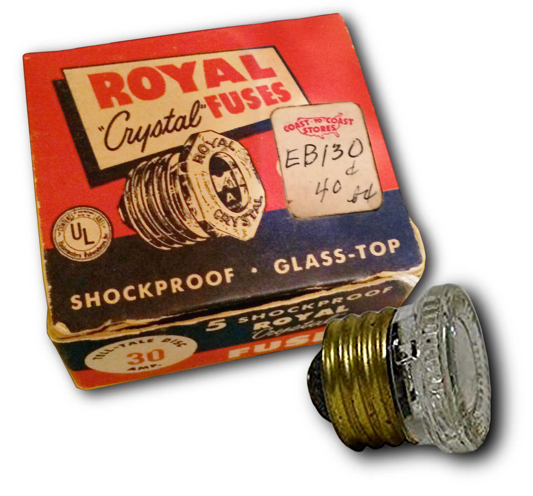
Royal Crystal Fuses
Who remembers these buggers? That scene with the old man changing the fuses in A Christmas Story was my old man. These were popping off all the time. This package is from the forties and I believe the ones we had in our house were from the forties. The Royal Switchgear product line was established as part of the Royal Electric Manufacturing Company in Chicago, Illinois in 1914. And it is still around today. The package is simple, clear and just a piece of beauty.
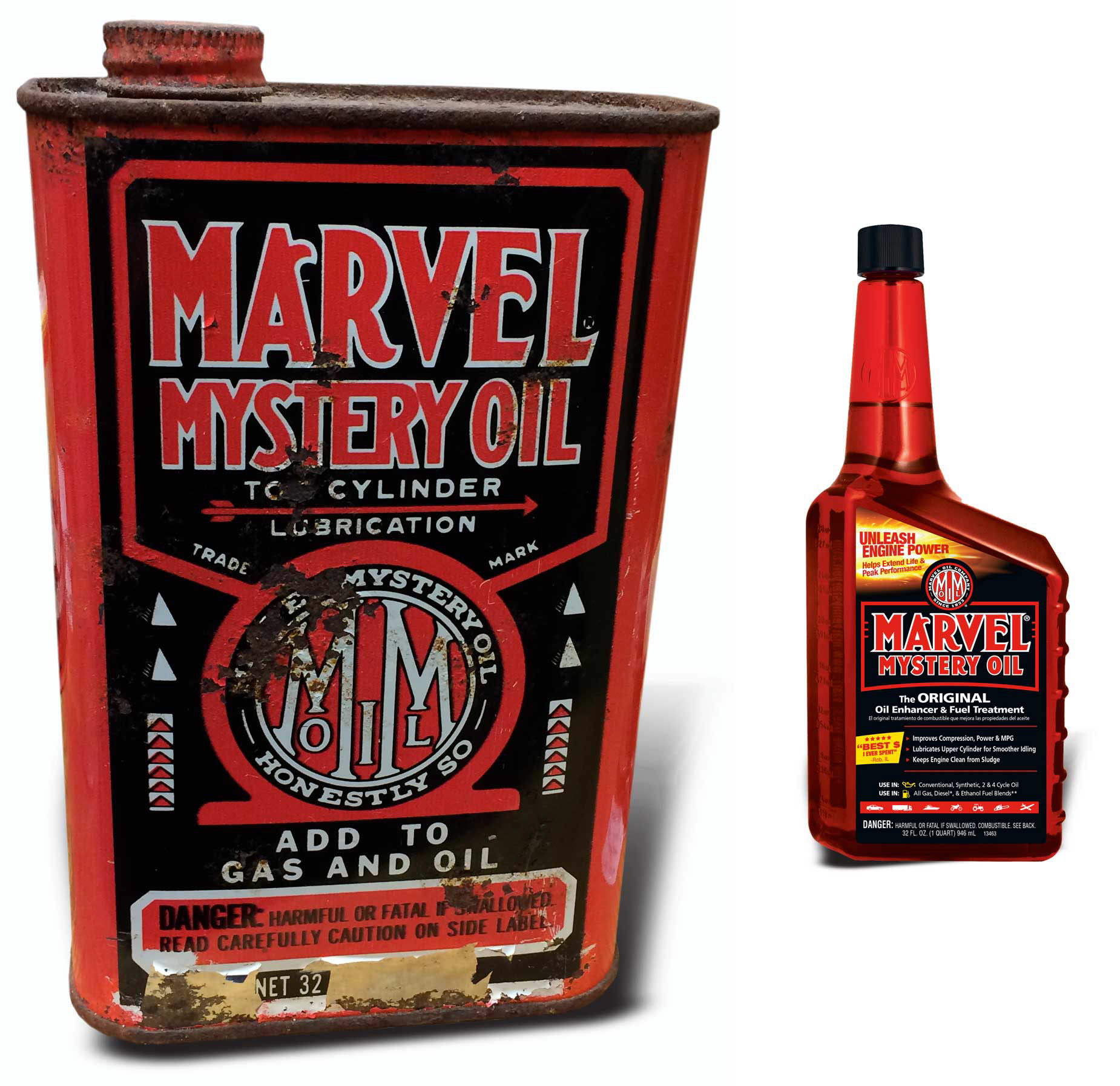
Marvel Mystery Oil
Here is another three-color typographic gem. All of the front surface is covered with type but is not too busy to read. And every bit of it reads power, performance and strength. I am glad to see the design carried forward, but it does not quite have the testosterone of the original.
Here is a bit of history from Marvel Oil Company:
Burt Pierce founded the Marvel Oil Company in 1923. His reputation for ingenuity preceded him as he was already well-known for inventing the Marvel Carburetor, standard equipment on 80% of all vehicles produced after World War I.
Vehicles of the post WWI era encountered carburetor problems, the most perplexing being clogged jets due to high lead content and other contaminants found in the gasoline of the time. The problem motivated Mr. Pierce to direct his creative ingenuity towards formulating a blend of chemicals and petroleum products to clean and maintain clogged jets. He was successful beyond his wildest expectations and the legend was born!
Why the name Mystery Oil? Burt Pierce refused to divulge the formula for his new product and answered all inquiries as to its make-up with "It's a Mystery!" The name caught on and is still recognized today for its "mysterious" ability to cure and prevent almost any engine ailment.
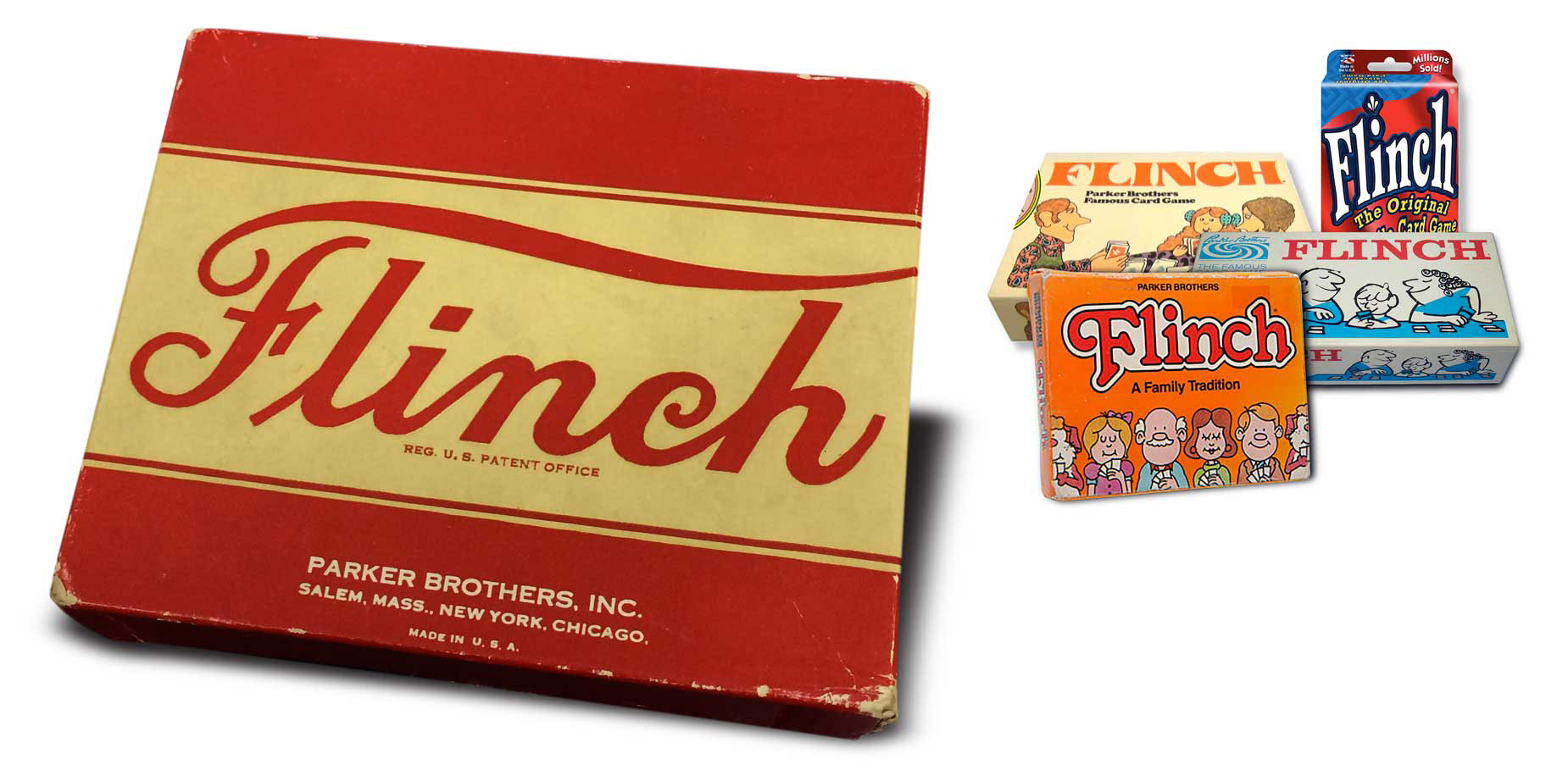
Flinch Playing Cards
This card game was invented in 1901 by A.J. Patterson who grew up on a farm in Eaton County, Michigan. He came up with the idea while playing cards and he decided to create the game and the deck. Thus began the Flinch Card Company. Flinch went on to become a national sensation. By the time Patterson sold the rights to Parker Brothers in 1936, over seven and a half million had been sold.
This pack is from 1938. As you can see it has change a lot over the years and not so much for the good. What I like about this simple design is that it is simple but also it’s huge comb-over on the script font. Gratefully it is not orange.
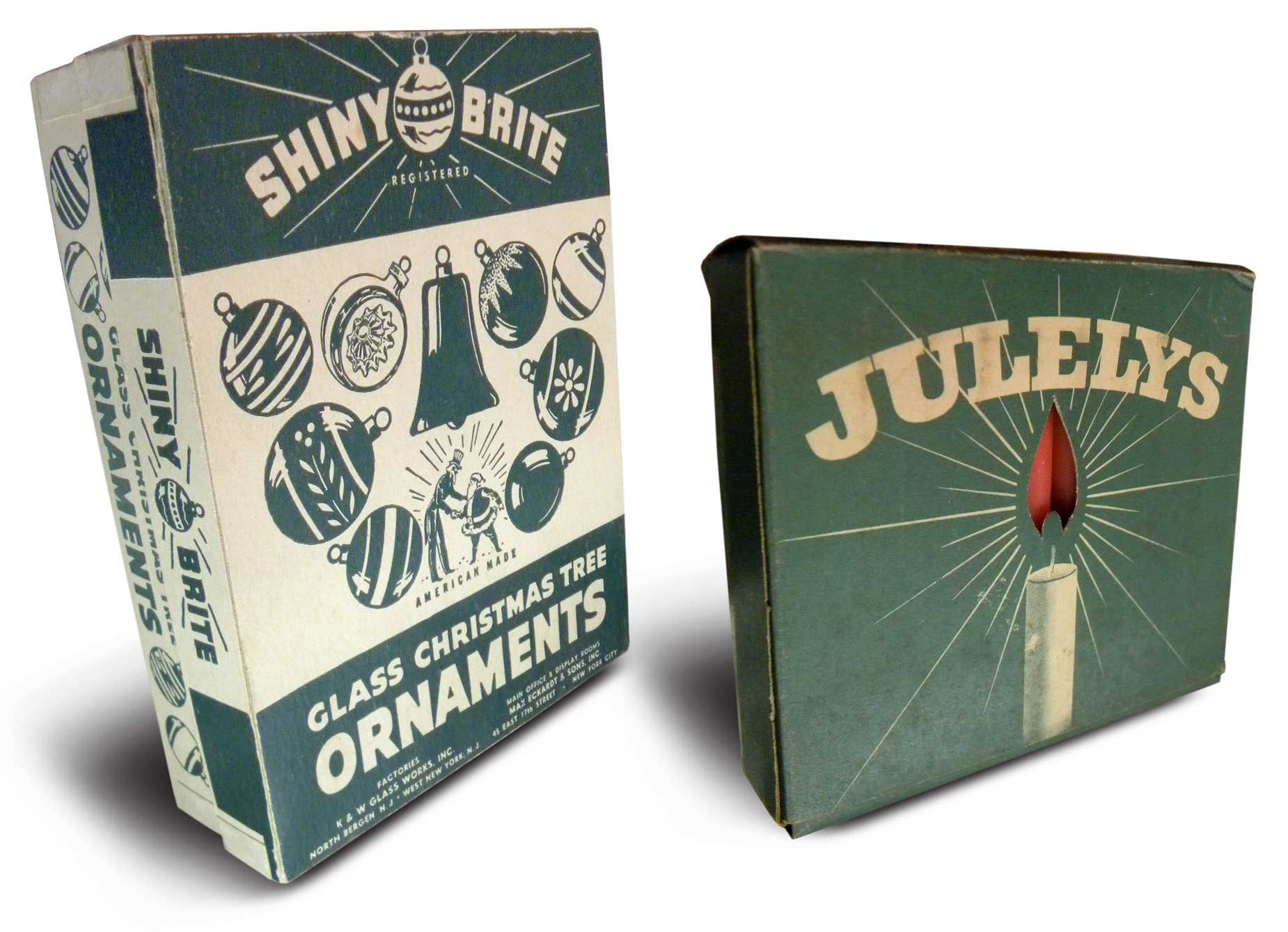
Shiny Brite Christmas Ornaments Box and Juleys Candles
The Shiny Brite package is from 1940s with the telling sign of Uncle Sam shaking Santa’s hand on the box. Max Eckardt founded Shiny Brite ornaments in 1937. The company disappeared in the 60s but since 2001 Christopher Radko has re-issued Shiny Brite's most popular kitschy designs.
I could not find anything on the Juleys Candles box to date it but the package seems to be also from the 1940s. All I could find was that they were a Danish company and that they produced a variety of candles for the holidays.
What I like both about these two is the simple use of green to say Christmas. No red except for the die-cut window to show the candles as flames for the Juleys box. And they both use very clean illustrations with bold sans or slab type. I know we had a box of Shiny Brites in our cubby-hole.
Maybe that is why I am attracted to them.
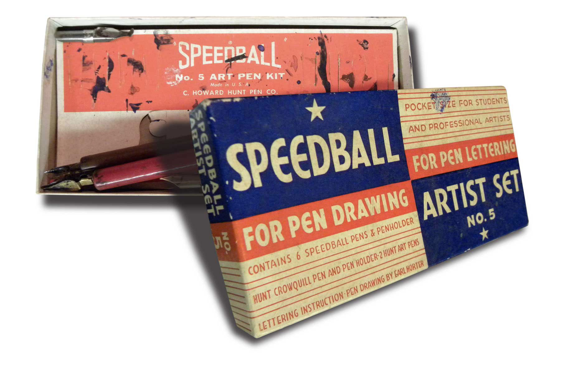
Speedball Lettering Pen
I am old enough to have gone to art school when they taught typography be using rapidographs, ruling pens and ink pens to draw type faces. So I have a bit of fondness and disdain for this object. The worst was the ruling pen, a very old-fashioned precision drafting tool. It is one of the tools that allowed illustrators and letterers to create art that they now use Adobe Illustrator to do. A ruling pen is a two-pronged fork that looks like a tweezer with a screw that spreads the points closer together or farther apart. You would be just finishing your assignment and the ink would decide to come gushing out all over your work.
What I like about this piece is the lean “pocket size” two color package with it’s all cap serif fonts speaking to “students and professional artists.” I am guessing by the choice of fonts this is from the late forties to early fifties.
“The Speedball Lettering pen was the brain child of graphic designer and sign painter Ross F. George (1889-1959) and William Hugh Gordon (1855-1936), who is widely acknowledged as one of America’s premier designers of commercial lettering of his era. George and Gordon’s biggest claim to fame was for inventing a breakthrough form of ink pen — one with a built-in reservoir for ink that also featured a unique, replaceable square-tipped nib. This nib allowed for making thin or broad lines depending on how the artist held it. The new pen sped up the work of designers who previously had been stuck laboring slowly with brushes and fine ink-dip or fountain pens.”
—Peter Blecha. historylink.org
For more information on Ross F. George, William Hugh Gordon and the Speedball Lettering Pen go to:
To see an example of William Hugh Gordon’s Black Face Poster alphabet from 1918 go to:
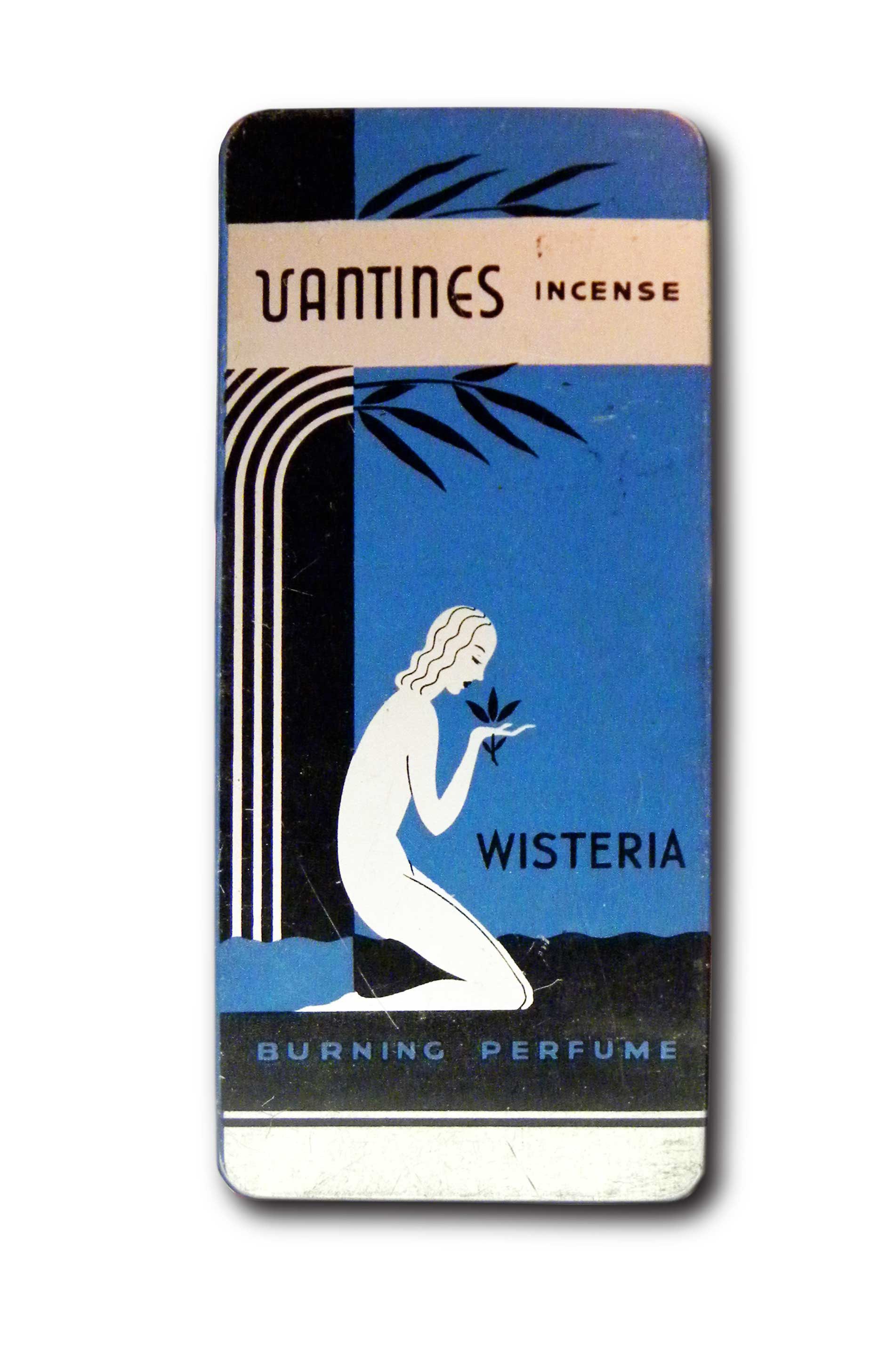
Vantine’s Wisteria Incense Tin Box
Wow, this is just simply stunning! It is a fine example of Art Deco from the graphic to the use of typography. Clean, simple, and beautiful. This piece is from the import company Ashley Abraham Vantine Inc. of New York which was founded in 1869.
I believe this piece dates back some where around the 1920’s. With a love of beautiful objects from the Orient, Mr. Vantine introduce these items to the American market. You can see more examples of the merchandise and get more on the history of Ashley Abraham Vantine at a great site call Vantine’s Oriental Store.
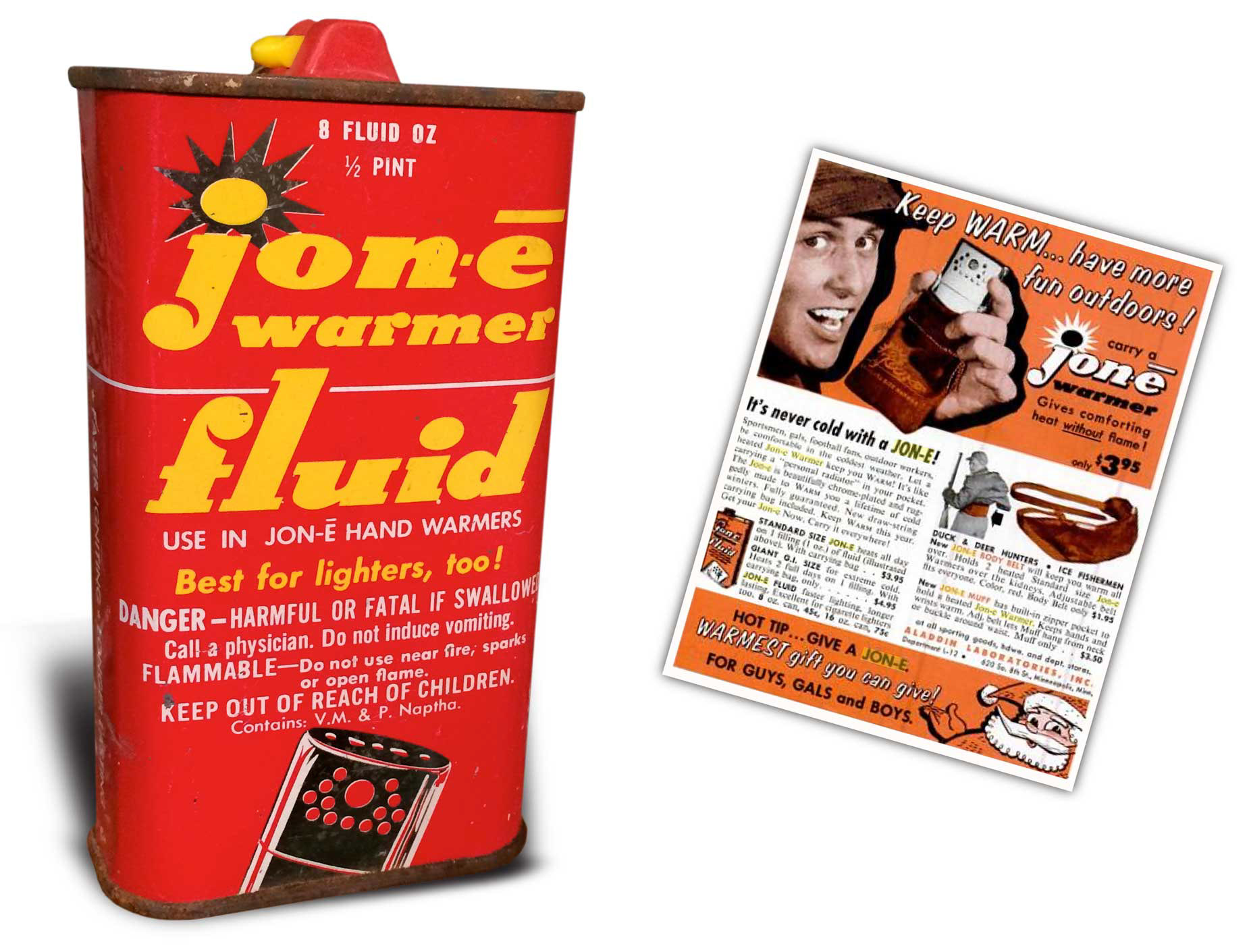
JON-E-Warmer Fluid Can
This can supplies the fluid for the JON-E Hand Warmer by Aladdin Manufacturing Company right here in good Ole Minnesota. Of course.
I am not sure how old this is but here it is on display from a 1958 ad. Though I love the warm colors with the squatty slab logo type and the way they got all that safety copy in without being too intrusive, the real reason I putting this in Lost & Found is from a memory frozen to my core. It is of standing for hours in black rubber boots on a iced sealed lake somewhere in the tundra of Minnesota. Those are the boots with the 1/16 ply rubber with the metal clasps that were caked with ice, shut tight for eternity. Not sure if wool socks were invented around this time. They were not in my house. I had on my Catholic school boys dress socks. These went with my jeans, shirt, jacket stocking hat and cloth gloves. We would stand around the hole that we cut with a hand powered auger trying to stay warm by using a brother as a wind block. You would relieve boredom by scooping the newly formed ice out of the hole before in sealed shut, which would not be long. My dad would stay out for hours and hours to bring home the prized 1/2 pound perch. If he felt compassion he would let you sit in the station wagon. Engine off of course. The one tiny bit of warmth was the over sized lighter call a JON-E Warmer. It slipped into this felt pouch then you slipped it into where ever you were cold. Being the youngest I only felt it’s warmth in it’s passing from sibling to sibling. What is amazing is that they still make these. I thought they passed around the same time as smoking in theaters.
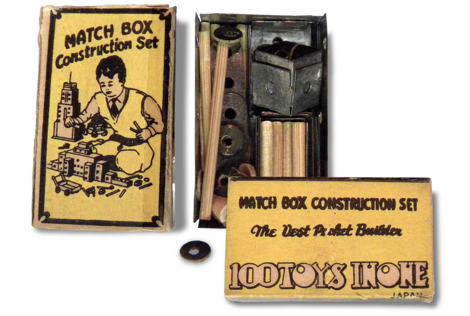
Marx Match Box Vest Pocket Construction Set
Isn’t this just wonderful? This is a small metal box with a paper slip cover that is filled with a miniature erector set.
But the real beauty of this is the fonts and art that cover a surface of only 2¼ by 1½ inches.
These are fonts that I come across when doing type searches and wonder I how I could ever possibly use them.
Here these three very different fonts are used in harmony matching the playful illustration that is beautifully detailed for such a small image.
This piece from the forties was produced by the famous toy firm Louis Marx & Co.
known for its early wind-up tinplate toys, yo-yos, Rock 'Em Sock 'Em Robots and Big Wheels.
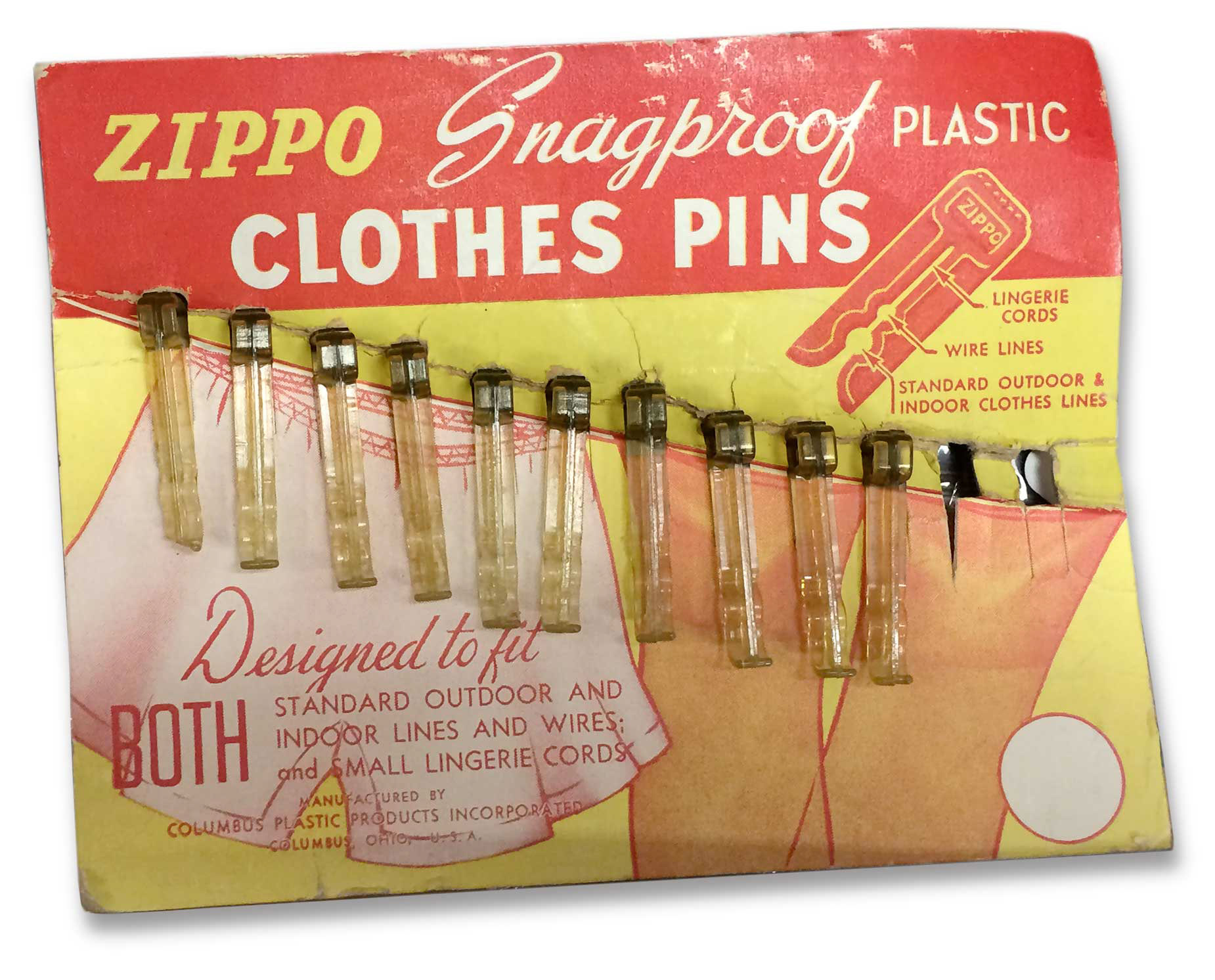
Zippo Snagproof Plastic Clothes Pins
Know for it’s iconic lighter which became very popular with World War II GIs, Zippo also made a variety of products from knives to clothes pins.
Here is an example of the “Zippo Snagproof Plastic Clothes Pins” display from around 1945.
What I like about this store shelf display is not only the use of just two colors,
but also the use of at least a half a dozen different fonts. A little Yin Yang thing going on here.
More on Zippos other products:
is the title of Michael Grimaldi’s book on the non-lighter products manufactured by Zippo.
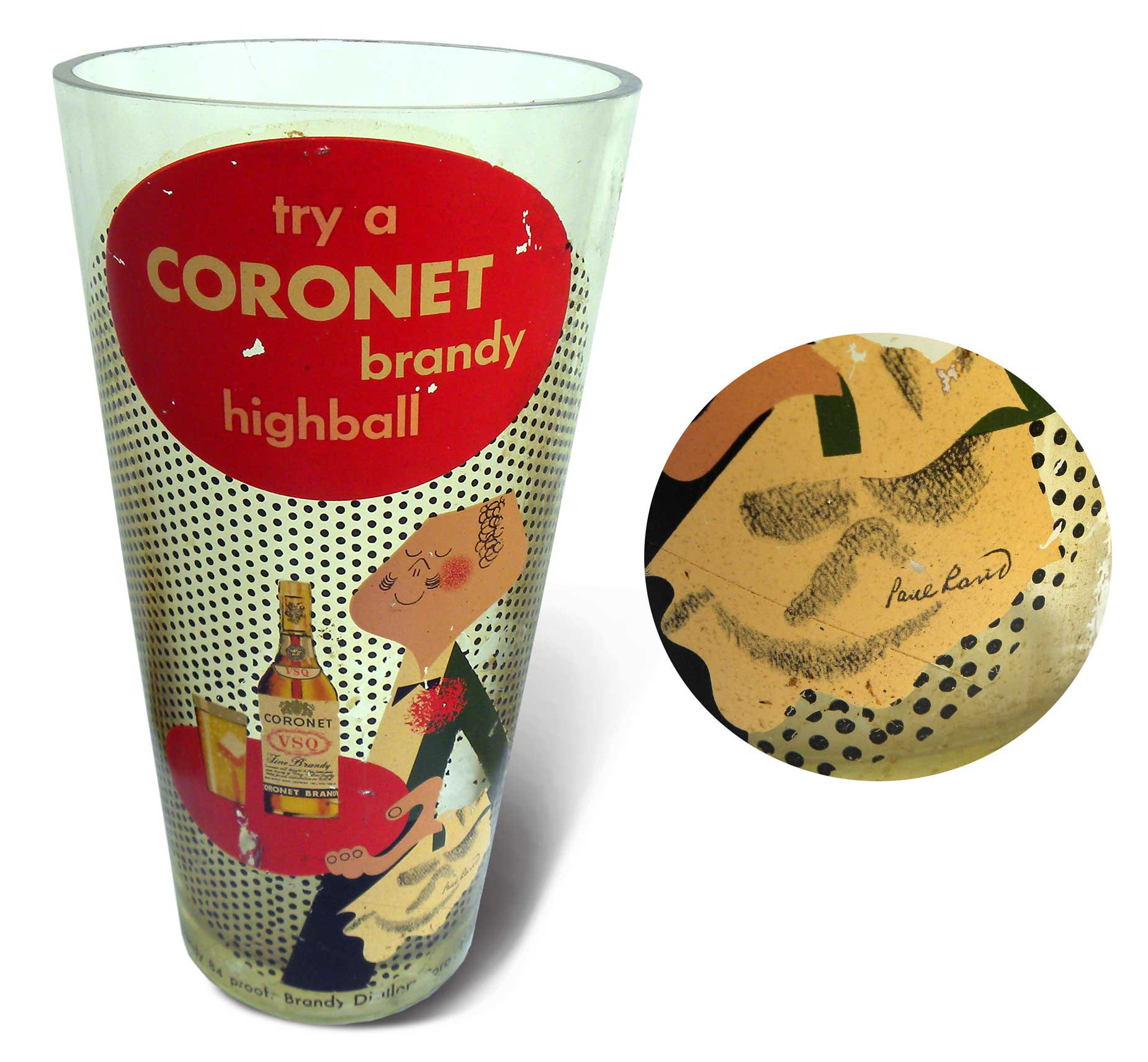
TRY A CORONET BRANDY HIGHBALL
Massive cocktail bar glass by Paul Rand
I found this large glass in a rural Wisconsin junk store. I just love that it has Paul Rand’s signature on it. The glass is piece of vintage liquor advertising I believe from the late forties-early fifties.
This highball cocktail bar glass is huge, measuring 14” tall x 7 1/2” diameter opening with a thickness of 1/4” and weights over 8 pounds. A keeper. It was most likely used to hold matchbooks or tips from the bar. If this was filled to the top by last call you had a very good night.
Rand ’s Coronet Brandy waiter, whose head is shaped like a brandy glass was commonly seen in printed magazine ads for Coronet. The waiter character was used in store displays and advertising. This Coronet logo of a butler style man was meant to be an advertisement piece but the company loved it so much they made it their logo.
You can find examples of the Coronet Campaign along with other great pieces of
Paul Rand’s work along with information about the artist at: http://www.paul-rand.com
© 2020 KORAB COMPANY DESIGN